검색결과 리스트
IT(Old)/Flutter에 해당되는 글 2건
- 2020.05.06 Layouts in Flutter
- 2020.05.06 Introduction to widgets
글
Layouts in Flutter
출처 : https://flutter.dev/docs/development/ui/layout
Layouts in Flutter
Contents
- Lay out a widget
- Lay out multiple widgets vertically and horizontally
- Common layout widgets
- Constraints
- Videos
- Other resources
What's the point?
- Widgets are classes used to build UIs.
- Widgets are used for both layout and UI elements.
- Compose simple widgets to build complex widgets.
The core of Flutter’s layout mechanism is widgets. In Flutter, almost everything is a widget—even layout models are widgets. The images, icons, and text that you see in a Flutter app are all widgets. But things you don’t see are also widgets, such as the rows, columns, and grids that arrange, constrain, and align the visible widgets.
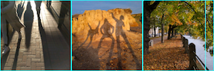
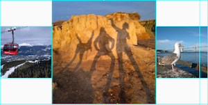
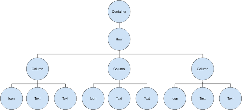
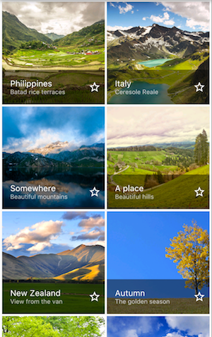
You create a layout by composing widgets to build more complex widgets. For example, the first screenshot below shows 3 icons with a label under each one:
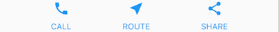

The second screenshot displays the visual layout, showing a row of 3 columns where each column contains an icon and a label.
Note: Most of the screenshots in this tutorial are displayed with debugPaintSizeEnabled set to true so you can see the visual layout. For more information, see Debugging layout issues visually, a section in Using the Flutter inspector.
Here’s a diagram of the widget tree for this UI:

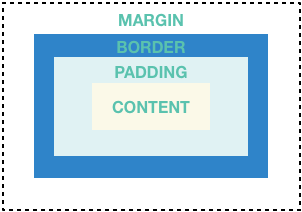
Most of this should look as you might expect, but you might be wondering about the containers (shown in pink). Container is a widget class that allows you to customize its child widget. Use a Container when you want to add padding, margins, borders, or background color, to name some of its capabilities.
In this example, each Text widget is placed in a Container to add margins. The entire Row is also placed in a Container to add padding around the row.
The rest of the UI in this example is controlled by properties. Set an Icon’s color using its color property. Use the Text.style property to set the font, its color, weight, and so on. Columns and rows have properties that allow you to specify how their children are aligned vertically or horizontally, and how much space the children should occupy.
Lay out a widget
How do you layout a single widget in Flutter? This section shows you how to create and display a simple widget. It also shows the entire code for a simple Hello World app.
In Flutter, it takes only a few steps to put text, an icon, or an image on the screen.
1. Select a layout widget
Choose from a variety of layout widgets based on how you want to align or constrain the visible widget, as these characteristics are typically passed on to the contained widget.
This example uses Center which centers its content horizontally and vertically.
2. Create a visible widget
For example, create a Text widget:
content_copy
Text('Hello World'),
Create an Image widget:
content_copy
Image.asset( 'images/lake.jpg', fit: BoxFit.cover, ),
Create an Icon widget:
content_copy
Icon( Icons.star, color: Colors.red[500], ),
3. Add the visible widget to the layout widget
All layout widgets have either of the following:
- A child property if they take a single child—for example, Center or Container
- A children property if they take a list of widgets—for example, Row, Column, ListView, or Stack.
Add the Text widget to the Center widget:
content_copy
Center( child: Text('Hello World'), ),
4. Add the layout widget to the page
A Flutter app is itself a widget, and most widgets have a build() method. Instantiating and returning a widget in the app’s build() method displays the widget.
Material apps
For a Material app, you can use a Scaffold widget; it provides a default banner, background color, and has API for adding drawers, snack bars, and bottom sheets. Then you can add the Center widget directly to the body property for the home page.
lib/main.dart (MyApp)
content_copy
class MyApp extends StatelessWidget { @override Widget build(BuildContext context) { return MaterialApp( title: 'Flutter layout demo', home: Scaffold( appBar: AppBar( title: Text('Flutter layout demo'), ), body: Center( child: Text('Hello World'), ), ), ); } }
Note: The Material library implements widgets that follow Material Design principles. When designing your UI, you can exclusively use widgets from the standard widgets library, or you can use widgets from the Material library. You can mix widgets from both libraries, you can customize existing widgets, or you can build your own set of custom widgets.
Non-Material apps
For a non-Material app, you can add the Center widget to the app’s build() method:
lib/main.dart (MyApp)
content_copy
class MyApp extends StatelessWidget { @override Widget build(BuildContext context) { return Container( decoration: BoxDecoration(color: Colors.white), child: Center( child: Text( 'Hello World', textDirection: TextDirection.ltr, style: TextStyle( fontSize: 32, color: Colors.black87, ), ), ), ); } }
By default a non-Material app doesn’t include an AppBar, title, or background color. If you want these features in a non-Material app, you have to build them yourself. This app changes the background color to white and the text to dark grey to mimic a Material app.
That’s it! When you run the app, you should see Hello World.
App source code:

Lay out multiple widgets vertically and horizontally
One of the most common layout patterns is to arrange widgets vertically or horizontally. You can use a Row widget to arrange widgets horizontally, and a Column widget to arrange widgets vertically.
What's the point?
- Row and Column are two of the most commonly used layout patterns.
- Row and Column each take a list of child widgets.
- A child widget can itself be a Row, Column, or other complex widget.
- You can specify how a Row or Column aligns its children, both vertically and horizontally.
- You can stretch or constrain specific child widgets.
- You can specify how child widgets use the Row’s or Column’s available space.
To create a row or column in Flutter, you add a list of children widgets to a Row or Column widget. In turn, each child can itself be a row or column, and so on. The following example shows how it is possible to nest rows or columns inside of rows or columns.
This layout is organized as a Row. The row contains two children: a column on the left, and an image on the right:
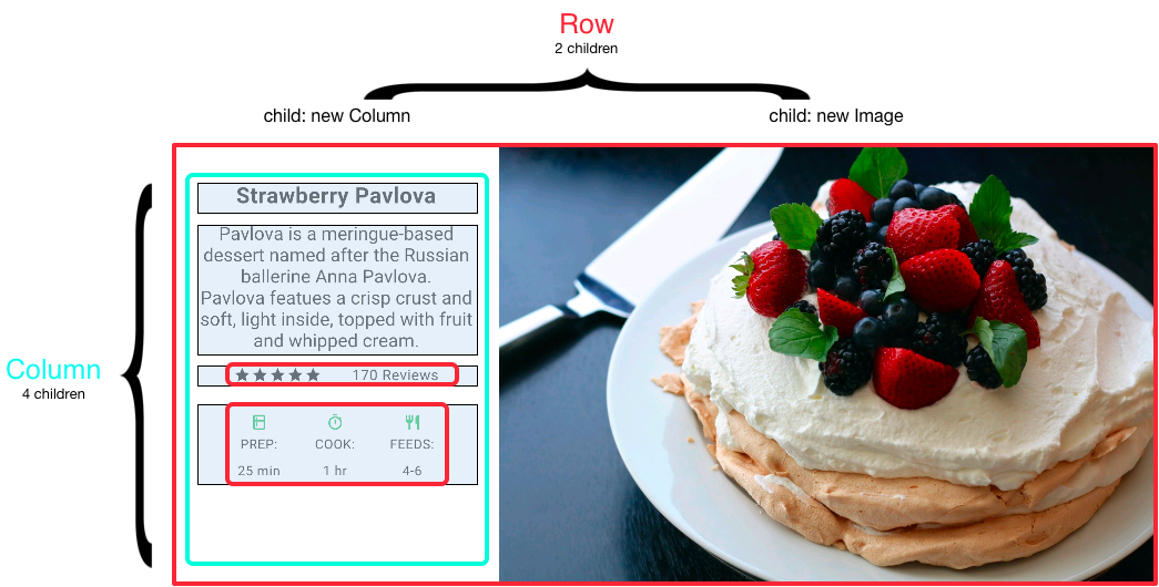
The left column’s widget tree nests rows and columns.
You’ll implement some of Pavlova’s layout code in Nesting rows and columns.
Note: Row and Column are basic primitive widgets for horizontal and vertical layouts—these low-level widgets allow for maximum customization. Flutter also offers specialized, higher level widgets that might be sufficient for your needs. For example, instead of Row you might prefer ListTile, an easy-to-use widget with properties for leading and trailing icons, and up to 3 lines of text. Instead of Column, you might prefer ListView, a column-like layout that automatically scrolls if its content is too long to fit the available space. For more information, see Common layout widgets.
Aligning widgets
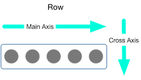
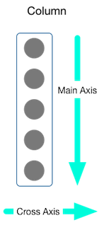
You control how a row or column aligns its children using the mainAxisAlignment and crossAxisAlignment properties. For a row, the main axis runs horizontally and the cross axis runs vertically. For a column, the main axis runs vertically and the cross axis runs horizontally.
The MainAxisAlignment and CrossAxisAlignment classes offer a variety of constants for controlling alignment.
Note: When you add images to your project, you need to update the pubspec.yaml file to access them—this example uses Image.asset to display the images. For more information, see this example’s pubspec.yaml file or Adding assets and images. You don’t need to do this if you’re referencing online images using Image.network.
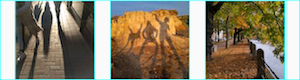
In the following example, each of the 3 images is 100 pixels wide. The render box (in this case, the entire screen) is more than 300 pixels wide, so setting the main axis alignment to spaceEvenly divides the free horizontal space evenly between, before, and after each image.
content_copy
Row( mainAxisAlignment: MainAxisAlignment.spaceEvenly, children: [ Image.asset('images/pic1.jpg'), Image.asset('images/pic2.jpg'), Image.asset('images/pic3.jpg'), ], );
App source: row_column
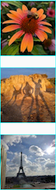
Columns work the same way as rows. The following example shows a column of 3 images, each is 100 pixels high. The height of the render box (in this case, the entire screen) is more than 300 pixels, so setting the main axis alignment to spaceEvenly divides the free vertical space evenly between, above, and below each image.
content_copy
Column( mainAxisAlignment: MainAxisAlignment.spaceEvenly, children: [ Image.asset('images/pic1.jpg'), Image.asset('images/pic2.jpg'), Image.asset('images/pic3.jpg'), ], );
App source: row_column
Sizing widgets
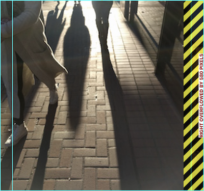
When a layout is too large to fit a device, a yellow and black striped pattern appears along the affected edge. Here is an example of a row that is too wide:
Widgets can be sized to fit within a row or column by using the Expanded widget. To fix the previous example where the row of images is too wide for its render box, wrap each image with an Expanded widget.
content_copy
Row( crossAxisAlignment: CrossAxisAlignment.center, children: [ Expanded( child: Image.asset('images/pic1.jpg'), ), Expanded( child: Image.asset('images/pic2.jpg'), ), Expanded( child: Image.asset('images/pic3.jpg'), ), ], );
App source: sizing
Perhaps you want a widget to occupy twice as much space as its siblings. For this, use the Expanded widget flex property, an integer that determines the flex factor for a widget. The default flex factor is 1. The following code sets the flex factor of the middle image to 2:
content_copy
Row( crossAxisAlignment: CrossAxisAlignment.center, children: [ Expanded( child: Image.asset('images/pic1.jpg'), ), Expanded( flex: 2, child: Image.asset('images/pic2.jpg'), ), Expanded( child: Image.asset('images/pic3.jpg'), ), ], );
App source: sizing
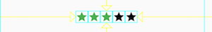
Packing widgets
By default, a row or column occupies as much space along its main axis as possible, but if you want to pack the children closely together, set its mainAxisSize to MainAxisSize.min. The following example uses this property to pack the star icons together.
content_copy
Row( mainAxisSize: MainAxisSize.min, children: [ Icon(Icons.star, color: Colors.green[500]), Icon(Icons.star, color: Colors.green[500]), Icon(Icons.star, color: Colors.green[500]), Icon(Icons.star, color: Colors.black), Icon(Icons.star, color: Colors.black), ], )
App source: pavlova
Nesting rows and columns
The layout framework allows you to nest rows and columns inside of rows and columns as deeply as you need. Let’s look at the code for the outlined section of the following layout:

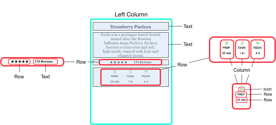
The outlined section is implemented as two rows. The ratings row contains five stars and the number of reviews. The icons row contains three columns of icons and text.
The widget tree for the ratings row:
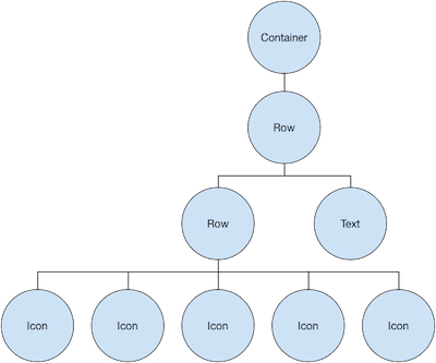
The ratings variable creates a row containing a smaller row of 5 star icons, and text:
content_copy
var stars = Row( mainAxisSize: MainAxisSize.min, children: [ Icon(Icons.star, color: Colors.green[500]), Icon(Icons.star, color: Colors.green[500]), Icon(Icons.star, color: Colors.green[500]), Icon(Icons.star, color: Colors.black), Icon(Icons.star, color: Colors.black), ], ); final ratings = Container( padding: EdgeInsets.all(20), child: Row( mainAxisAlignment: MainAxisAlignment.spaceEvenly, children: [ stars, Text( '170 Reviews', style: TextStyle( color: Colors.black, fontWeight: FontWeight.w800, fontFamily: 'Roboto', letterSpacing: 0.5, fontSize: 20, ), ), ], ), );
Tip: To minimize the visual confusion that can result from heavily nested layout code, implement pieces of the UI in variables and functions.
The icons row, below the ratings row, contains 3 columns; each column contains an icon and two lines of text, as you can see in its widget tree:
The iconList variable defines the icons row:
content_copy
final descTextStyle = TextStyle( color: Colors.black, fontWeight: FontWeight.w800, fontFamily: 'Roboto', letterSpacing: 0.5, fontSize: 18, height: 2, ); // DefaultTextStyle.merge() allows you to create a default text // style that is inherited by its child and all subsequent children. final iconList = DefaultTextStyle.merge( style: descTextStyle, child: Container( padding: EdgeInsets.all(20), child: Row( mainAxisAlignment: MainAxisAlignment.spaceEvenly, children: [ Column( children: [ Icon(Icons.kitchen, color: Colors.green[500]), Text('PREP:'), Text('25 min'), ], ), Column( children: [ Icon(Icons.timer, color: Colors.green[500]), Text('COOK:'), Text('1 hr'), ], ), Column( children: [ Icon(Icons.restaurant, color: Colors.green[500]), Text('FEEDS:'), Text('4-6'), ], ), ], ), ), );
The leftColumn variable contains the ratings and icons rows, as well as the title and text that describes the Pavlova:
content_copy
final leftColumn = Container( padding: EdgeInsets.fromLTRB(20, 30, 20, 20), child: Column( children: [ titleText, subTitle, ratings, iconList, ], ), );
The left column is placed in a Container to constrain its width. Finally, the UI is constructed with the entire row (containing the left column and the image) inside a Card.
The Pavlova image is from Pixabay. You can embed an image from the net using Image.network() but, for this example, the image is saved to an images directory in the project, added to the pubspec file, and accessed using Images.asset(). For more information, see Adding assets and images.
content_copy
body: Center( child: Container( margin: EdgeInsets.fromLTRB(0, 40, 0, 30), height: 600, child: Card( child: Row( crossAxisAlignment: CrossAxisAlignment.start, children: [ Container( width: 440, child: leftColumn, ), mainImage, ], ), ), ), ),
Tip: The Pavlova example runs best horizontally on a wide device, such as a tablet. If you are running this example in the iOS simulator, you can select a different device using the Hardware > Device menu. For this example, we recommend the iPad Pro. You can change its orientation to landscape mode using Hardware > Rotate. You can also change the size of the simulator window (without changing the number of logical pixels) using Window > Scale.
App source: pavlova
Common layout widgets
Flutter has a rich library of layout widgets. Here are a few of those most commonly used. The intent is to get you up and running as quickly as possible, rather than overwhelm you with a complete list. For information on other available widgets, refer to the Widget catalog, or use the Search box in the API reference docs. Also, the widget pages in the API docs often make suggestions about similar widgets that might better suit your needs.
The following widgets fall into two categories: standard widgets from the widgets library, and specialized widgets from the Material library. Any app can use the widgets library but only Material apps can use the Material Components library.
Standard widgets
- Container: Adds padding, margins, borders, background color, or other decorations to a widget.
- GridView: Lays widgets out as a scrollable grid.
- ListView: Lays widgets out as a scrollable list.
- Stack: Overlaps a widget on top of another.
Material widgets
- Card: Organizes related info into a box with rounded corners and a drop shadow.
- ListTile: Organizes up to 3 lines of text, and optional leading and trailing icons, into a row.
Container
Many layouts make liberal use of Containers to separate widgets using padding, or to add borders or margins. You can change the device’s background by placing the entire layout into a Container and changing its background color or image.
Summary (Container)
- Add padding, margins, borders
- Change background color or image
- Contains a single child widget, but that child can be a Row, Column, or even the root of a widget tree
Examples (Container)
This layout consists of a column with two rows, each containing 2 images. A Container is used to change the background color of the column to a lighter grey.
content_copy
Widget _buildImageColumn() => Container( decoration: BoxDecoration( color: Colors.black26, ), child: Column( children: [ _buildImageRow(1), _buildImageRow(3), ], ), );
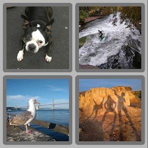
A Container is also used to add a rounded border and margins to each image:
content_copy
Widget _buildDecoratedImage(int imageIndex) => Expanded( child: Container( decoration: BoxDecoration( border: Border.all(width: 10, color: Colors.black38), borderRadius: const BorderRadius.all(const Radius.circular(8)), ), margin: const EdgeInsets.all(4), child: Image.asset('images/pic$imageIndex.jpg'), ), ); Widget _buildImageRow(int imageIndex) => Row( children: [ _buildDecoratedImage(imageIndex), _buildDecoratedImage(imageIndex + 1), ], );
You can find more Container examples in the tutorial and the Flutter Gallery (running app, repo).
App source: container
GridView
Use GridView to lay widgets out as a two-dimensional list. GridView provides two pre-fabricated lists, or you can build your own custom grid. When a GridView detects that its contents are too long to fit the render box, it automatically scrolls.
Summary (GridView)
- Lays widgets out in a grid
- Detects when the column content exceeds the render box and automatically provides scrolling
- Build your own custom grid, or use one of the provided grids:
- GridView.count allows you to specify the number of columns
- GridView.extent allows you to specify the maximum pixel width of a tile
Note: When displaying a two-dimensional list where it’s important which row and column a cell occupies (for example, it’s the entry in the “calorie” column for the “avocado” row), use Table or DataTable.
Examples (GridView)
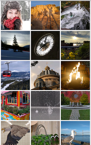
Uses GridView.extent to create a grid with tiles a maximum 150 pixels wide.
App source: grid_and_list
Uses GridView.count to create a grid that’s 2 tiles wide in portrait mode, and 3 tiles wide in landscape mode. The titles are created by setting the footer property for each GridTile.
Dart code: grid_list_demo.dart from the Flutter Gallery
content_copy
Widget _buildGrid() => GridView.extent( maxCrossAxisExtent: 150, padding: const EdgeInsets.all(4), mainAxisSpacing: 4, crossAxisSpacing: 4, children: _buildGridTileList(30)); // The images are saved with names pic0.jpg, pic1.jpg...pic29.jpg. // The List.generate() constructor allows an easy way to create // a list when objects have a predictable naming pattern. List<Container> _buildGridTileList(int count) => List.generate( count, (i) => Container(child: Image.asset('images/pic$i.jpg')));
ListView
ListView, a column-like widget, automatically provides scrolling when its content is too long for its render box.
Summary (ListView)
- A specialized Column for organizing a list of boxes
- Can be laid out horizontally or vertically
- Detects when its content won’t fit and provides scrolling
- Less configurable than Column, but easier to use and] supports scrolling
Examples (ListView)

Uses ListView to display a list of businesses using] ListTiles. A Divider separates the theaters from the restaurants.
App source: grid_and_list
Uses ListView to display the Colors from the Material Design palette for a particular color family.
Dart code: colors_demo.dart from the Flutter Gallery
content_copy
Widget _buildList() => ListView( children: [ _tile('CineArts at the Empire', '85 W Portal Ave', Icons.theaters), _tile('The Castro Theater', '429 Castro St', Icons.theaters), _tile('Alamo Drafthouse Cinema', '2550 Mission St', Icons.theaters), _tile('Roxie Theater', '3117 16th St', Icons.theaters), _tile('United Artists Stonestown Twin', '501 Buckingham Way', Icons.theaters), _tile('AMC Metreon 16', '135 4th St #3000', Icons.theaters), Divider(), _tile('Kescaped_code#39;s Kitchen', '757 Monterey Blvd', Icons.restaurant), _tile('Emmyescaped_code#39;s Restaurant', '1923 Ocean Ave', Icons.restaurant), _tile( 'Chaiya Thai Restaurant', '272 Claremont Blvd', Icons.restaurant), _tile('La Ciccia', '291 30th St', Icons.restaurant), ], ); ListTile _tile(String title, String subtitle, IconData icon) => ListTile( title: Text(title, style: TextStyle( fontWeight: FontWeight.w500, fontSize: 20, )), subtitle: Text(subtitle), leading: Icon( icon, color: Colors.blue[500], ), );
Stack
Use Stack to arrange widgets on top of a base widget—often an image. The widgets can completely or partially overlap the base widget.
Summary (Stack)
- Use for widgets that overlap another widget
- The first widget in the list of children is the base widget; subsequent children are overlaid on top of that base widget
- A Stack’s content can’t scroll
- You can choose to clip children that exceed the render box
Examples (Stack)

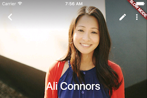
Uses Stack to overlay a Container (that displays its Text on a translucent black background) on top of a CircleAvatar. The Stack offsets the text using the alignment property and Alignments.
App source: card_and_stack
Uses Stack to overlay a gradient to the top of the image. The gradient ensures that the toolbar’s icons are distinct against the image.
Dart code: contacts_demo.dart from the Flutter Gallery
content_copy
Widget _buildStack() => Stack( alignment: const Alignment(0.6, 0.6), children: [ CircleAvatar( backgroundImage: AssetImage('images/pic.jpg'), radius: 100, ), Container( decoration: BoxDecoration( color: Colors.black45, ), child: Text( 'Mia B', style: TextStyle( fontSize: 20, fontWeight: FontWeight.bold, color: Colors.white, ), ), ), ], );
Card
A Card, from the Material library, contains related nuggets of information and can be composed from almost any widget, but is often used with ListTile. Card has a single child, but its child can be a column, row, list, grid, or other widget that supports multiple children. By default, a Card shrinks its size to 0 by 0 pixels. You can use SizedBox to constrain the size of a card.
In Flutter, a Card features slightly rounded corners and a drop shadow, giving it a 3D effect. Changing a Card’s elevation property allows you to control the drop shadow effect. Setting the elevation to 24, for example, visually lifts the Card further from the surface and causes the shadow to become more dispersed. For a list of supported elevation values, see Elevation in the Material guidelines. Specifying an unsupported value disables the drop shadow entirely.
Summary (Card)
- Implements a Material card
- Used for presenting related nuggets of information
- Accepts a single child, but that child can be a Row, Column, or other widget that holds a list of children
- Displayed with rounded corners and a drop shadow
- A Card’s content can’t scroll
- From the Material library
Examples (Card)

A Card containing 3 ListTiles and sized by wrapping it with a SizedBox. A Divider separates the first and second ListTiles.
App source: card_and_stack
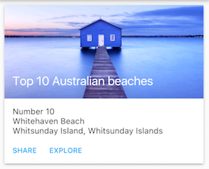
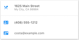
A Card containing an image and text.
Dart code: cards_demo.dart from the Flutter Gallery
content_copy
Widget _buildCard() => SizedBox( height: 210, child: Card( child: Column( children: [ ListTile( title: Text('1625 Main Street', style: TextStyle(fontWeight: FontWeight.w500)), subtitle: Text('My City, CA 99984'), leading: Icon( Icons.restaurant_menu, color: Colors.blue[500], ), ), Divider(), ListTile( title: Text('(408) 555-1212', style: TextStyle(fontWeight: FontWeight.w500)), leading: Icon( Icons.contact_phone, color: Colors.blue[500], ), ), ListTile( title: Text('costa@example.com'), leading: Icon( Icons.contact_mail, color: Colors.blue[500], ), ), ], ), ), );
ListTile
Use ListTile, a specialized row widget from the Material library, for an easy way to create a row containing up to 3 lines of text and optional leading and trailing icons. ListTile is most commonly used in Card or ListView, but can be used elsewhere.
Summary (ListTile)
- A specialized row that contains up to 3 lines of text and optional icons
- Less configurable than Row, but easier to use
- From the Material library
Examples (ListTile)
A Card containing 3 ListTiles.
App source: card_and_stack
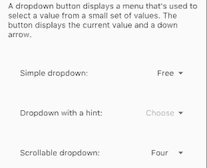
Uses ListTile to list 3 drop down button types.
Dart code: buttons_demo.dart from the Flutter Gallery
Constraints
To fully understand Flutter’s layout system, you need to learn how Flutter positions and sizes the components in a layout. For more information, see Understanding constraints.
Videos
The following videos, part of the Flutter in Focus series, explain Stateless and Stateful widgets.
Each episode of the Widget of the Week series focuses on a widget. Several of them includes layout widgets.
Flutter Widget of the Week playlist
Other resources
The following resources might help when writing layout code.
- Layout tutorialLearn how to build a layout.
- Widget catalogDescribes many of the widgets available in Flutter.
- HTML/CSS Analogs in FlutterFor those familiar with web programming, this page maps HTML/CSS functionality to Flutter features.
- Flutter Gallery running app, repoDemo app showcasing many Material Design widgets and other Flutter features.
- API reference docsReference documentation for all of the Flutter libraries.
- Dealing with Box Constraints in FlutterDiscusses how widgets are constrained by their render boxes.
- Adding assets and imagesExplains how to add images and other assets to your app’s package.
- Zero to One with FlutterOne person’s experience writing his first Flutter app.
설정
트랙백
댓글
글
Introduction to widgets
출처: https://flutter.dev/docs/development/ui/widgets-intro
Introduction to widgets
Contents
- Hello world
- Basic widgets
- Using Material Components
- Handling gestures
- Changing widgets in response to input
- Bringing it all together
- Responding to widget lifecycle events
- Keys
- Global keys
Flutter widgets are built using a modern framework that takes inspiration from React. The central idea is that you build your UI out of widgets. Widgets describe what their view should look like given their current configuration and state. When a widget’s state changes, the widget rebuilds its description, which the framework diffs against the previous description in order to determine the minimal changes needed in the underlying render tree to transition from one state to the next.
Note: If you would like to become better acquainted with Flutter by diving into some code, check out basic layout codelab, building layouts, and adding interactivity to your Flutter app.
Hello world
The minimal Flutter app simply calls the runApp() function with a widget:
content_copy
import 'package:flutter/material.dart'; void main() { runApp( Center( child: Text( 'Hello, world!', textDirection: TextDirection.ltr, ), ), ); }
The runApp() function takes the given Widget and makes it the root of the widget tree. In this example, the widget tree consists of two widgets, the Center widget and its child, the Text widget. The framework forces the root widget to cover the screen, which means the text “Hello, world” ends up centered on screen. The text direction needs to be specified in this instance; when the MaterialApp widget is used, this is taken care of for you, as demonstrated later.
When writing an app, you’ll commonly author new widgets that are subclasses of either StatelessWidget or StatefulWidget, depending on whether your widget manages any state. A widget’s main job is to implement a build() function, which describes the widget in terms of other, lower-level widgets. The framework builds those widgets in turn until the process bottoms out in widgets that represent the underlying RenderObject, which computes and describes the geometry of the widget.
Basic widgets
Flutter comes with a suite of powerful basic widgets, of which the following are commonly used:
TextThe Text widget lets you create a run of styled text within your application.Row, ColumnThese flex widgets let you create flexible layouts in both the horizontal (Row) and vertical (Column) directions. The design of these objects is based on the web’s flexbox layout model.StackInstead of being linearly oriented (either horizontally or vertically), a Stack widget lets you place widgets on top of each other in paint order. You can then use the Positioned widget on children of a Stack to position them relative to the top, right, bottom, or left edge of the stack. Stacks are based on the web’s absolute positioning layout model.ContainerThe Container widget lets you create a rectangular visual element. A container can be decorated with a BoxDecoration, such as a background, a border, or a shadow. A Container can also have margins, padding, and constraints applied to its size. In addition, a Container can be transformed in three dimensional space using a matrix.
Below are some simple widgets that combine these and other widgets:
content_copy
import 'package:flutter/material.dart'; class MyAppBar extends StatelessWidget { MyAppBar({this.title}); // Fields in a Widget subclass are always marked "final". final Widget title; @override Widget build(BuildContext context) { return Container( height: 56.0, // in logical pixels padding: const EdgeInsets.symmetric(horizontal: 8.0), decoration: BoxDecoration(color: Colors.blue[500]), // Row is a horizontal, linear layout. child: Row( // <Widget> is the type of items in the list. children: <Widget>[ IconButton( icon: Icon(Icons.menu), tooltip: 'Navigation menu', onPressed: null, // null disables the button ), // Expanded expands its child to fill the available space. Expanded( child: title, ), IconButton( icon: Icon(Icons.search), tooltip: 'Search', onPressed: null, ), ], ), ); } } class MyScaffold extends StatelessWidget { @override Widget build(BuildContext context) { // Material is a conceptual piece of paper on which the UI appears. return Material( // Column is a vertical, linear layout. child: Column( children: <Widget>[ MyAppBar( title: Text( 'Example title', style: Theme.of(context).primaryTextTheme.title, ), ), Expanded( child: Center( child: Text('Hello, world!'), ), ), ], ), ); } } void main() { runApp(MaterialApp( title: 'My app', // used by the OS task switcher home: MyScaffold(), )); }
Be sure to have a uses-material-design: true entry in the flutter section of your pubspec.yaml file. It allows you to use the predefined set of Material icons.
content_copy
name: my_app flutter: uses-material-design: true
Many Material Design widgets need to be inside of a MaterialApp to display properly, in order to inherit theme data. Therefore, run the application with a MaterialApp.
The MyAppBar widget creates a Container with a height of 56 device-independent pixels with an internal padding of 8 pixels, both on the left and the right. Inside the container, MyAppBar uses a Row layout to organize its children. The middle child, the title widget, is marked as Expanded, which means it expands to fill any remaining available space that hasn’t been consumed by the other children. You can have multiple Expanded children and determine the ratio in which they consume the available space using the flex argument to Expanded.
The MyScaffold widget organizes its children in a vertical column. At the top of the column it places an instance of MyAppBar, passing the app bar a Text widget to use as its title. Passing widgets as arguments to other widgets is a powerful technique that lets you create generic widgets that can be reused in a wide variety of ways. Finally, MyScaffold uses an Expanded to fill the remaining space with its body, which consists of a centered message.
For more information, see Layouts.
Using Material Components
Flutter provides a number of widgets that help you build apps that follow Material Design. A Material app starts with the MaterialApp widget, which builds a number of useful widgets at the root of your app, including a Navigator, which manages a stack of widgets identified by strings, also known as “routes”. The Navigator lets you transition smoothly between screens of your application. Using the MaterialApp widget is entirely optional but a good practice.
content_copy
import 'package:flutter/material.dart'; void main() { runApp(MaterialApp( title: 'Flutter Tutorial', home: TutorialHome(), )); } class TutorialHome extends StatelessWidget { @override Widget build(BuildContext context) { // Scaffold is a layout for the major Material Components. return Scaffold( appBar: AppBar( leading: IconButton( icon: Icon(Icons.menu), tooltip: 'Navigation menu', onPressed: null, ), title: Text('Example title'), actions: <Widget>[ IconButton( icon: Icon(Icons.search), tooltip: 'Search', onPressed: null, ), ], ), // body is the majority of the screen. body: Center( child: Text('Hello, world!'), ), floatingActionButton: FloatingActionButton( tooltip: 'Add', // used by assistive technologies child: Icon(Icons.add), onPressed: null, ), ); } }
Now that the code has switched from MyAppBar and MyScaffold to the AppBar and Scaffold widgets, and from material.dart, the app is starting to look at bit more Material. For example, the app bar has a shadow and the title text inherits the correct styling automatically. A floating action button is also added.
Notice that widgets are passed as arguments to other widgets. The Scaffold widget takes a number of different widgets as named arguments, each of which are placed in the Scaffold layout in the appropriate place. Similarly, the AppBar widget lets you pass in widgets for the leading widget, and the actions of the title widget. This pattern recurs throughout the framework and is something you might consider when designing your own widgets.
For more information, see Material Components widgets.
Note: Material is one of the 2 bundled designs included with Flutter. To create an iOS-centric design, see the Cupertino components package, which has its own versions of CupertinoApp, and CupertinoNavigationBar.
Handling gestures
Most applications include some form of user interaction with the system. The first step in building an interactive application is to detect input gestures. See how that works by creating a simple button:
content_copy
class MyButton extends StatelessWidget { @override Widget build(BuildContext context) { return GestureDetector( onTap: () { print('MyButton was tapped!'); }, child: Container( height: 36.0, padding: const EdgeInsets.all(8.0), margin: const EdgeInsets.symmetric(horizontal: 8.0), decoration: BoxDecoration( borderRadius: BorderRadius.circular(5.0), color: Colors.lightGreen[500], ), child: Center( child: Text('Engage'), ), ), ); } }
The GestureDetector widget doesn’t have a visual representation but instead detects gestures made by the user. When the user taps the Container, the GestureDetector calls its onTap() callback, in this case printing a message to the console. You can use GestureDetector to detect a variety of input gestures, including taps, drags, and scales.
Many widgets use a GestureDetector to provide optional callbacks for other widgets. For example, the IconButton, RaisedButton, and FloatingActionButton widgets have onPressed() callbacks that are triggered when the user taps the widget.
For more information, see Gestures in Flutter.
Changing widgets in response to input
So far, this page has used only stateless widgets. Stateless widgets receive arguments from their parent widget, which they store in final member variables. When a widget is asked to build(), it uses these stored values to derive new arguments for the widgets it creates.
In order to build more complex experiences—for example, to react in more interesting ways to user input—applications typically carry some state. Flutter uses StatefulWidgets to capture this idea. StatefulWidgets are special widgets that know how to generate State objects, which are then used to hold state. Consider this basic example, using the RaisedButton mentioned earlier:
content_copy
class Counter extends StatefulWidget { // This class is the configuration for the state. It holds the // values (in this case nothing) provided by the parent and used // by the build method of the State. Fields in a Widget // subclass are always marked "final". @override _CounterState createState() => _CounterState(); } class _CounterState extends State<Counter> { int _counter = 0; void _increment() { setState(() { // This call to setState tells the Flutter framework that // something has changed in this State, which causes it to rerun // the build method below so that the display can reflect the // updated values. If you change _counter without calling // setState(), then the build method won't be called again, // and so nothing would appear to happen. _counter++; }); } @override Widget build(BuildContext context) { // This method is rerun every time setState is called, // for instance, as done by the _increment method above. // The Flutter framework has been optimized to make rerunning // build methods fast, so that you can just rebuild anything that // needs updating rather than having to individually change // instances of widgets. return Row( children: <Widget>[ RaisedButton( onPressed: _increment, child: Text('Increment'), ), Text('Count: $_counter'), ], ); } }
You might wonder why StatefulWidget and State are separate objects. In Flutter, these two types of objects have different life cycles. Widgets are temporary objects, used to construct a presentation of the application in its current state. State objects, on the other hand, are persistent between calls to build(), allowing them to remember information.
The example above accepts user input and directly uses the result in its build() method. In more complex applications, different parts of the widget hierarchy might be responsible for different concerns; for example, one widget might present a complex user interface with the goal of gathering specific information, such as a date or location, while another widget might use that information to change the overall presentation.
In Flutter, change notifications flow “up” the widget hierarchy by way of callbacks, while current state flows “down” to the stateless widgets that do presentation. The common parent that redirects this flow is the State. The following slightly more complex example shows how this works in practice:
content_copy
class CounterDisplay extends StatelessWidget { CounterDisplay({this.count}); final int count; @override Widget build(BuildContext context) { return Text('Count: $count'); } } class CounterIncrementor extends StatelessWidget { CounterIncrementor({this.onPressed}); final VoidCallback onPressed; @override Widget build(BuildContext context) { return RaisedButton( onPressed: onPressed, child: Text('Increment'), ); } } class Counter extends StatefulWidget { @override _CounterState createState() => _CounterState(); } class _CounterState extends State<Counter> { int _counter = 0; void _increment() { setState(() { ++_counter; }); } @override Widget build(BuildContext context) { return Row(children: <Widget>[ CounterIncrementor(onPressed: _increment), CounterDisplay(count: _counter), ]); } }
Notice the creation of two new stateless widgets, cleanly separating the concerns of displaying the counter (CounterDisplay) and changing the counter (CounterIncrementor). Although the net result is the same as the previous example, the separation of responsibility allows greater complexity to be encapsulated in the individual widgets, while maintaining simplicity in the parent.
For more information, see:
Bringing it all together
What follows is a more complete example that brings together these concepts: A hypothetical shopping application displays various products offered for sale, and maintains a shopping cart for intended purchases. Start by defining the presentation class, ShoppingListItem:
content_copy
class Product { const Product({this.name}); final String name; } typedef void CartChangedCallback(Product product, bool inCart); class ShoppingListItem extends StatelessWidget { ShoppingListItem({this.product, this.inCart, this.onCartChanged}) : super(key: ObjectKey(product)); final Product product; final bool inCart; final CartChangedCallback onCartChanged; Color _getColor(BuildContext context) { // The theme depends on the BuildContext because different parts // of the tree can have different themes. // The BuildContext indicates where the build is // taking place and therefore which theme to use. return inCart ? Colors.black54 : Theme.of(context).primaryColor; } TextStyle _getTextStyle(BuildContext context) { if (!inCart) return null; return TextStyle( color: Colors.black54, decoration: TextDecoration.lineThrough, ); } @override Widget build(BuildContext context) { return ListTile( onTap: () { onCartChanged(product, inCart); }, leading: CircleAvatar( backgroundColor: _getColor(context), child: Text(product.name[0]), ), title: Text(product.name, style: _getTextStyle(context)), ); } }
The ShoppingListItem widget follows a common pattern for stateless widgets. It stores the values it receives in its constructor in final member variables, which it then uses during its build() function. For example, the inCart boolean toggles between two visual appearances: one that uses the primary color from the current theme, and another that uses gray.
When the user taps the list item, the widget doesn’t modify its inCart value directly. Instead, the widget calls the onCartChanged function it received from its parent widget. This pattern lets you store state higher in the widget hierarchy, which causes the state to persist for longer periods of time. In the extreme, the state stored on the widget passed to runApp() persists for the lifetime of the application.
When the parent receives the onCartChanged callback, the parent updates its internal state, which triggers the parent to rebuild and create a new instance of ShoppingListItem with the new inCart value. Although the parent creates a new instance of ShoppingListItem when it rebuilds, that operation is cheap because the framework compares the newly built widgets with the previously built widgets and applies only the differences to the underlying RenderObject.
Here’s an example parent widget that stores mutable state:
content_copy
class ShoppingList extends StatefulWidget { ShoppingList({Key key, this.products}) : super(key: key); final List<Product> products; // The framework calls createState the first time a widget // appears at a given location in the tree. // If the parent rebuilds and uses the same type of // widget (with the same key), the framework re-uses the State object // instead of creating a new State object. @override _ShoppingListState createState() => _ShoppingListState(); } class _ShoppingListState extends State<ShoppingList> { Set<Product> _shoppingCart = Set<Product>(); void _handleCartChanged(Product product, bool inCart) { setState(() { // When a user changes what's in the cart, you need to change // _shoppingCart inside a setState call to trigger a rebuild. // The framework then calls build, below, // which updates the visual appearance of the app. if (!inCart) _shoppingCart.add(product); else _shoppingCart.remove(product); }); } @override Widget build(BuildContext context) { return Scaffold( appBar: AppBar( title: Text('Shopping List'), ), body: ListView( padding: EdgeInsets.symmetric(vertical: 8.0), children: widget.products.map((Product product) { return ShoppingListItem( product: product, inCart: _shoppingCart.contains(product), onCartChanged: _handleCartChanged, ); }).toList(), ), ); } } void main() { runApp(MaterialApp( title: 'Shopping App', home: ShoppingList( products: <Product>[ Product(name: 'Eggs'), Product(name: 'Flour'), Product(name: 'Chocolate chips'), ], ), )); }
The ShoppingList class extends StatefulWidget, which means this widget stores mutable state. When the ShoppingList widget is first inserted into the tree, the framework calls the createState() function to create a fresh instance of _ShoppingListState to associate with that location in the tree. (Notice that subclasses of State are typically named with leading underscores to indicate that they are private implementation details.) When this widget’s parent rebuilds, the parent creates a new instance of ShoppingList, but the framework reuses the _ShoppingListState instance that is already in the tree rather than calling createState again.
To access properties of the current ShoppingList, the _ShoppingListState can use its widget property. If the parent rebuilds and creates a new ShoppingList, the _ShoppingListState rebuilds with the new widget value. If you wish to be notified when the widget property changes, override the didUpdateWidget() function, which is passed an oldWidget to let you compare the old widget with the current widget.
When handling the onCartChanged callback, the _ShoppingListState mutates its internal state by either adding or removing a product from _shoppingCart. To signal to the framework that it changed its internal state, it wraps those calls in a setState() call. Calling setState marks this widget as dirty and schedules it to be rebuilt the next time your app needs to update the screen. If you forget to call setState when modifying the internal state of a widget, the framework won’t know your widget is dirty and might not call the widget’s build() function, which means the user interface might not update to reflect the changed state. By managing state in this way, you don’t need to write separate code for creating and updating child widgets. Instead, you simply implement the build function, which handles both situations.
Responding to widget lifecycle events
After calling createState() on the StatefulWidget, the framework inserts the new state object into the tree and then calls initState() on the state object. A subclass of State can override initState to do work that needs to happen just once. For example, override initState to configure animations or to subscribe to platform services. Implementations of initState are required to start by calling super.initState.
When a state object is no longer needed, the framework calls dispose() on the state object. Override the dispose function to do cleanup work. For example, override dispose to cancel timers or to unsubscribe from platform services. Implementations of dispose typically end by calling super.dispose.
For more information, see State.
Keys
Use keys to control which widgets the framework matches up with other widgets when a widget rebuilds. By default, the framework matches widgets in the current and previous build according to their runtimeType and the order in which they appear. With keys, the framework requires that the two widgets have the same key as well as the same runtimeType.
Keys are most useful in widgets that build many instances of the same type of widget. For example, the ShoppingList widget, which builds just enough ShoppingListItem instances to fill its visible region:
-
Without keys, the first entry in the current build would always sync with the first entry in the previous build, even if, semantically, the first entry in the list just scrolled off screen and is no longer visible in the viewport.
-
By assigning each entry in the list a “semantic” key, the infinite list can be more efficient because the framework syncs entries with matching semantic keys and therefore similar (or identical) visual appearances. Moreover, syncing the entries semantically means that state retained in stateful child widgets remains attached to the same semantic entry rather than the entry in the same numerical position in the viewport.
For more information, see the Key API.
Global keys
Use global keys to uniquely identify child widgets. Global keys must be globally unique across the entire widget hierarchy, unlike local keys which need only be unique among siblings. Because they are globally unique, a global key can be used to retrieve the state associated with a widget.
For more information, see the GlobalKey API.